
Jan 30, 2026 Nico Raúl Meyer
ShareBuying ice cream leads to drowning—sounds absurd, right?
And yet, one might think that there is a connection: in the summer months, both sunscreen sales and the number of days spent swimming increase — and, statistically speaking, unfortunately so does the number of swimming accidents.

Cases of Drowning // Source: https://www.dlrg.de/informieren/die-dlrg/presse/statistik-ertrinken#t3gallery-8
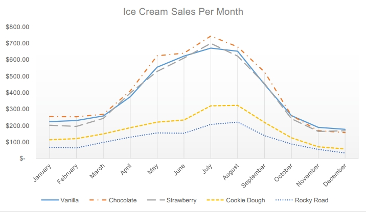
Ice Cream Sales per Month // Source: https://mrnussbaum.com/storage/uploads/activities/icecream/linegraph1.pdf
This apparent connection illustrates a typical problem in data analysis: we see parallel figures and believe there is a relationship. But in reality, there is usually a third variable behind it – in this case, the weather.
At a time when data is considered the new oil, we often trust figures blindly. Charts seem convincing, correlations clear. But those who make decisions based solely on common movements miss the true causes.
Correlation is not causation. This distinction is the key to better, data-driven decisions.
What does correlation mean – and what is true causation?
A correlation describes two variables changing together.
Causality means that one variable actually influences or causes another.
It sounds simple – but in everyday life, especially in business processes or AI-supported analyses, this boundary often becomes blurred. This leads to misinterpretations that can have negative economic consequences.
Everyday example: ice cream, sunglasses, and summer
When more ice cream is sold in summer and more sunglasses are bought at the same time, the graphs show almost identical curves. If you ignore your own experience and just look at the numbers, you might think, “People who buy ice cream also buy sunglasses.”
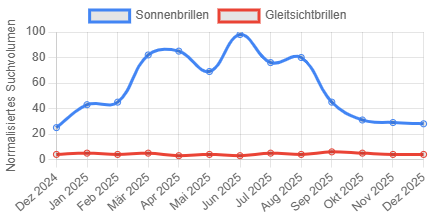
Sales of Sunglasses // Source: https://de.accio.com/business/trend-optik-harras
The actual cause is, of course, the warm, sunny weather. Both trends are related to the amount of sunshine, not to each other.
This example shows that correlation provides clues, but not proof.
Why misinterpreting data can be costly
In business, the difference between correlation and causation can mean the difference between success and failure.
Example: Rising production costs go hand in hand with longer delivery times. It would be easy to assume that “the high costs are causing the delays.”
This conclusion seems plausible – for example, because additional employees, rush orders, or rework can influence both costs and processes.
But this is not always the truth. Often, inefficient processes, poor planning, or inadequate forecasts are the real reason. Those who only look at statistical patterns are fighting the symptoms instead of the causes.
From patterns to insights – the path to proper data analysis
Today's companies collect huge amounts of data. But without the right models, decision-relevant knowledge remains hidden.
Methods such as machine learning and mathematical optimization enable deeper insights – but only if humans understand and classify them correctly.
Modern tools should reveal causalities, not just recognize patterns. They should help uncover real connections and make data explainable.

Practical example: Humans in the loop in machine learning projects
A few years ago, a bank conducted a machine learning project to uncover fraud patterns. The analysis showed that a particularly high number of fraud cases correlated with a specific employee name.
A purely data-based conclusion would have been: “If this name appears, fraud is likely.”
The reality: The employee was a clerk—and only handled cases suspected of fraud.
So the machine recognized a correlation, but not a real causality.
This example shows how important explainability and human context are in data-driven systems. Without “humans in the loop,” algorithms can misinterpret statistical correlations – with potentially serious consequences.
The human factor – intuition meets analytical logic
Humans are excellent at recognizing patterns. This ability has been essential for survival for thousands of years – it helps us see connections even when they are difficult to recognize.
But in today's data-driven economy, this very intuition can deceive us. We see numbers that rise together and interpret them as a meaningful connection. Sometimes, however, this connection is only statistical.
Good analysis tools must therefore not only evaluate data, but also offer explainability and transparency. They should show why results arise and which factors are actually decisive.
Only through the interaction of
- human experience (context and understanding of goals) and
- algorithmic logic (precise, in-depth analysis)
can robust and sustainable decisions be made.
Conclusion: From sunscreen to machine learning models – understanding causes, not just seeing numbers
Correlations are valuable – they can provide clues. But they are not enough for smart, long-term decisions. Only those who understand the causes behind the data can improve processes, minimize risks, and take advantage of opportunities in a targeted manner.
Whether it's ice cream sales, production data, or AI-supported fraud detection: numbers can be misleading if interpreted incorrectly.
In the end, it's not who has the most data that counts, but who understands it correctly.
Correlation can be misleading – causality creates clarity.
Those who look deeper and keep people in the loop make decisions that really work. Because intelligent data analysis means questioning stories before believing them.
About our Expert
Nico Raúl Meyer
Nico Raúl Meyer completed a student internship at INFORM in January and February 2026, where he worked in both Central Marketing and the Vehicle Logistics division. There, he gained a wide range of insights into the working world of an internationally active software company.